

A heuristic evaluation is a method for identifying design problems in a user interface. Evaluators judge the design against a set of guidelines (called heuristics) that make systems easy to use.
(For more information about how and why this tool was developed, read Jakob Nielsen's 1994 article, "The Theory Behind Heuristic Evaluations".)
Choosing a Set of Heuristics
A heuristic evaluation can be conducted with any set of heuristics. To assess usability, we recommend Jakob Nielsen’s 10 usability heuristics — a set of high-level guidelines based on an understanding of human behavior, psychology, and information processing. For specialized domains or types of usability assessments, you may consider using other domain-specific ones in addition.
When to Conduct a Heuristic Evaluation
Heuristic evaluations are useful for identifying glaring problems in an interface. That interface can be just about anything that users will interact with — including prototypes, physical products, games, virtual reality, or voice interfaces. The method can be particularly helpful early in the design process.
Heuristic evaluations are useful for stretching a limited UX research budget, because they help you find likely issues without having to test with participants.
However, heuristic evaluations cannot replace user research. User-experience design is highly contextual. To design good experiences, you’ll still need to test with actual users. But heuristic evaluations can complement your team’s research work; for example, conducting a heuristic evaluation in preparation for an upcoming usability test might help you identify the elements of the design that you should target during testing.
Conducting heuristic evaluations is also a good way to develop strong UX instincts. If you’re new to UX, consider using heuristic evaluations as a way to train yourself to catch common usability issues. Practice conducting these evaluations on many different types of products — whether you actually work on them or not.
Step 1: Prepare for a Heuristic Evaluation
Choose and Train Your Team
Heuristic evaluations work best when performed by a group of people, not just by one evaluator. This is because each individual (no matter how experienced or expert) is likely to miss some of the potential usability issues. Ideally, three to five people should independently evaluate the same interface.
Teams conducting their first heuristic evaluation will need a bit of training and preparation before they begin. Start by asking each person to read and understand the heuristics.
Next, consider doing a practice round with a simple design as a group. You might conduct a collaborative evaluation of a weather app, for example. The point of this practice round is to ensure that everyone on the team understands what they’re expected to do during an evaluation (more details on this in step 2.)
Decide How to Document Evaluations
Your evaluators will need a place to collect their observations. You might use:
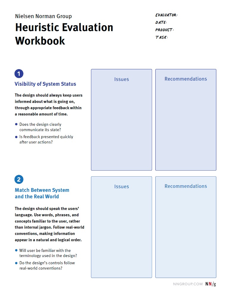
- Our heuristic-evaluation workbook: Each team member can fill out a printed or digital version of this interactive PDF. Download our free workbook to use it in your evaluation.
- A spreadsheet: Evaluators can capture one observation per line, along with its corresponding heuristic.
- A digital whiteboard: In a tool like Miro or Mural, create separate workspaces for each evaluator. Include screenshots of the interface and have evaluators place sticky notes directly on the elements they’re analyzing.
If you choose to use a shared document or space (like Google Sheets or a digital-whiteboard tool), your team members should not see each other’s evaluations until their own evaluation is complete. The point of having multiple evaluators is to capture independent observations, so you don’t want team members to influence each other.
Set the Scope
The narrower the scope, the easier and more detailed the evaluation will be. For your team’s first heuristic evaluation — or if you have a large, complex product — consider keeping your scope narrow to make things manageable.
Narrow your scope by looking at:
- One task at a time
- One section of the site or app
- One user group, if you have many with diverse needs
- One device type (desktop, tablet, mobile)
Step 2: Evaluate Independently
Next, each team member should evaluate the interface on their own.
It’s important to timebox this activity to make it manageable. We recommend reserving about 1–2 hours.
Become Familiar with the Product
Let’s consider a simple ecommerce example to explain how the evaluation might work.
Product: Banana Republic site
User Group: Shoppers
Task: Buying a shirt
Device: Mobile


Start the evaluation by moving through the interface as if you’re a user trying to complete a task. If you aren’t already familiar with this product, go through the task once just to learn the system, without attempting to evaluate anything.
Look for Issues
Once you feel comfortable and familiar with the product, go back through the task a second time. In this second pass, look for design elements, features, or decisions that violate one of the 10 heuristics — in other words, they don’t achieve that goal or follow that guideline. If you’re using our heuristic-evaluation template, those will be the things you write down in the appropriate Issues section.
For example, one of the 10 heuristics is aesthetic and minimalist design (#8). This heuristic recommends that the visual design of interfaces should direct users’ attention and help them achieve their goals. The product should not feel visually overwhelming or distracting.
Banana Republic’s listing pages layer the product details (name, price, discount) in white text directly on top of the product images. As a result, the page feels cluttered, and the text is difficult to read. This is an example of how the visual design fails to support the user’s task (choosing and buying a shirt).

In the heuristic evaluation workbook, we might write “Text overlaps with product images on listing pages” in the issues column for heuristic #8. If a recommendation for a fix comes to mind, you can note that in the second column under Recommendations. For example, “Improve product-detail visibility — maybe add a solid or semi-opaque background behind text.”

Another heuristic is recognition rather than recall (#6). As much as possible in the design, we want to reduce the burden on people’s short-term memory by keeping important information visible on the screen.
We might notice that Banana Republic is using a hamburger menu as their global navigation — their navigation categories are hidden behind a menu icon in the upper left-hand corner. We might decide to document that as a violation of heuristic #6.

This example brings up something important to note: just because a design choice violates a heuristic, that does not necessarily mean it’s a problem that needs to be fixed — it depends on the particular context and the available alternatives. Hamburger menus do violate heuristic #6, but, in mobile designs, that tradeoff is often necessary due to reduced screen space.
This is a great illustration of why heuristic evaluations are not a replacement for user research. We still need to observe our users as they are using our products to fully understand design problems.
Step 3: Consolidate Identified Issues
Once all your team members have performed their independent evaluations, it’s time to synthesize the issues. Affinity diagramming (clustering similar issues) on a physical or virtual whiteboard can work well.
Discuss with your team:
- Where do we agree? Where do we disagree?
- Which issues seem most detrimental to the overall experience?
- Which issues could be most problematic for our organization or business goals?
- Which issues do we need more data on? Which should we prioritize in our next usability test?
- What steps can we take in the short and long term to address these problems?
Exceptions
There are exceptions to these heuristics, but they’re typically rare and based on context. Heuristics are guidelines, not laws, and there are some cases where you may have to violate a heuristic in pursuit of another goal (as was the case with Banana Republic’s hamburger menu).
But, as Jakob Nielsen says, “you should not bet that your design is one of the few exceptions.” Before deciding to intentionally violate a usability heuristic, conduct user research to ensure your rule breaking is justified.
Conclusion
Heuristic evaluations become easier the more you conduct them. With practice, you’ll need to rely less and less on the actual heuristics. You’ll start to develop UX instincts, so you can quickly recognize potential usability problems.
References
Nielsen, J., and Molich, R. (1990). Heuristic evaluation of user interfaces, Proc. ACM CHI'90 Conf. (Seattle, WA, 1-5 April), 249-256.
Nielsen, J. (1994). Heuristic evaluation. In Nielsen, J., and Mack, R.L. (Eds.), Usability Inspection Methods. John Wiley & Sons, New York, NY.
Nielsen, J., and Landauer, T. K. 1993. A mathematical model of the finding of usability problems. Proceedings ACM/IFIP INTERCHI'93 Conference (Amsterdam, The Netherlands, April 24-29), 206-213.


